Before emoji, before image messaging, people made pictures out of letters, numbers and punctuation. This craft is called ASCII art, and it is still alive in chat messages, code comments and email signatures. It is also one of the friendliest ways to learn how computers handle text.
A short history
ASCII is a character set standardised in the 1960s. It defined 128 characters, including the English alphabet, digits, punctuation and a few control codes. Early computer terminals and printers could only print these characters, so anyone who wanted a picture had to build it from them. The idea was older than computers, because typists had already been making pictures with typewriters for decades.
As bulletin boards, email and early online games spread, people added ASCII drawings to their messages: banners, animals, logos and small scenes. Even now, programmers sometimes start a file with a text banner. Today we have Unicode, which includes thousands of extra symbols, and the craft has grown to use them. The name ASCII art is still used for most text pictures.
Why monospaced fonts matter
ASCII art relies on a grid. Every character must take up the same width so that lines stack neatly. A monospaced font, in which every character has equal width, gives you that grid. In a proportional font, a narrow letter such as i takes less room than a wide letter such as m, so the picture falls apart. That is why a drawing that looks perfect in a code editor can look broken in a social media caption.
Drawing your first picture
- Open a plain text editor that uses a monospaced font, such as Notepad on Windows or any code editor.
- Start small. Aim for five or six lines, no more than 15 characters wide.
- Sketch with simple shapes. Slashes, underscores and parentheses make outlines, and dots and letters make features.
- Think about density. Characters differ in how much ink they use. A period is light, a colon slightly more, a hash symbol heavy, and the at sign heaviest. Use light ones for highlights and heavy ones for shadows.
- Preview it. Paste it in a message to yourself and check how it looks.
Here is a small cat to copy and modify:
 /_/
( o.o )
 > ^ <
Change the eyes, add whiskers or give it a bow. Each tweak teaches you how the characters interact.
Why pictures break
- Proportional fonts. The most common cause. If the app uses one, the lines no longer align.
- Automatic wrapping. Phones wrap long lines. Keep each line short.
- Trimmed spaces. Some apps remove leading spaces, which shifts the picture. If you see this, add a character such as a dot at the start of each line.
- Special symbols. Backslashes and asterisks may be read as formatting by some apps.
Use a code block when you can
Several apps, including Discord and Telegram, let you wrap text in a code block, normally by placing three backticks before and after the text. This switches to a monospaced font and keeps spaces intact, which makes ASCII art look the way you drew it. Check how your chosen app handles it before posting.
Beyond plain ASCII
Modern text art mixes in characters from blocks such as Box Drawing, Block Elements and Geometric Shapes. These give you smooth lines and shading that plain ASCII cannot. If you want to learn what each group offers, read our beginner guide to Unicode blocks.
Ready-made pieces
If you want to practise by modifying, our ASCII art page has small pictures such as cats, bunnies and hearts that you can copy. Try changing them one detail at a time. For a quick expressive alternative that works in any app, take a look at the kaomoji collection too, since those little text faces solve the same need in a single line.
Your first drawing: a cat in three lines
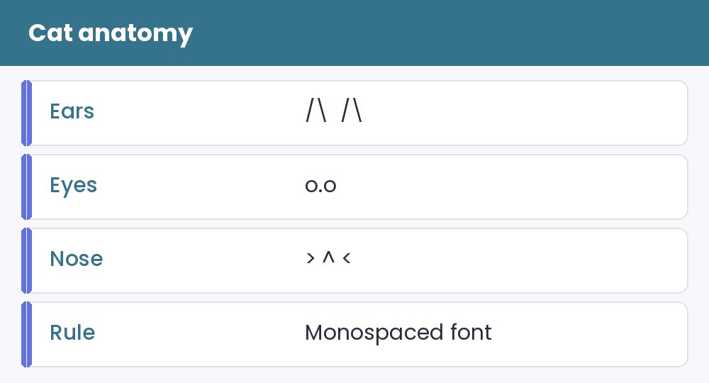
Here is a classic starter picture. The ears are a slash and a backslash, the eyes are two letters o with a dot between them, and the whiskers are simple arrows.
 /_/
( o.o )
 > ^ <
Notice how each line contains only a few characters, yet the brain fills in the rest. Try changing the eyes to dashes for a sleepy cat, or to caret signs for a happy one. Small edits give a lot of personality, and that is the whole charm of the craft.
Fixing alignment when a picture falls apart
Most broken pictures have the same few causes. Spaces collapse in proportional fonts, tabs turn into unpredictable gaps and the app may wrap long lines. Paste your art into a code block or a monospaced note and check it there first. If you use it in a chat, keep the picture narrow so it does not wrap on small screens.
Browse the ASCII art page for tested pictures, then compare them with the more compact kaomoji faces, which survive proportional fonts better. A small divider above and below a picture keeps it from looking lost inside a long caption.