A long caption with no structure feels heavy before anyone’s read a word. People skim, get lost and keep scrolling. A small divider line gives the eye a place to rest, and it takes two seconds to add.
Where dividers help
- Between a story and the practical details, like the date, price or link.
- Before a list of hashtags or credits.
- In a Facebook or Instagram post with several short sections.
- In a bio, to separate lines when line breaks are hard to see.
Types of dividers
- Straight lines like ────── or ━━━━━━. Clean and neutral.
- Dots and dashes like · · · · · or – – – -. Quiet and modern.
- Symbol lines like ✦ ✦ ✦ or ❖ ──── ❖. A bit more personality.
- Emoji lines like 🌸🌸🌸. Fun, but they differ across phones and read badly to screen readers.
You’ll find all of these on the text dividers page, ready to copy.
Keep them phone-sized
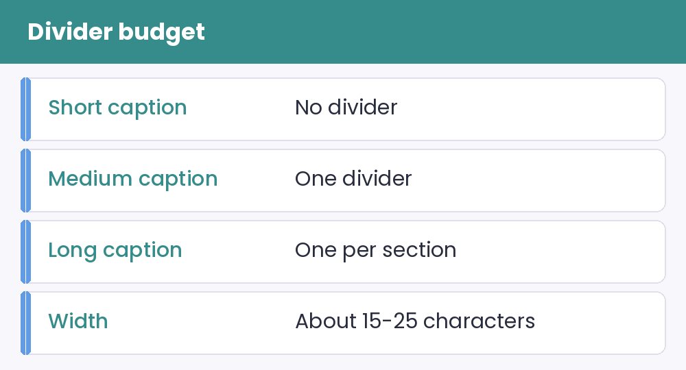
A divider that’s too long wraps onto a second line and looks like a mistake. Phone screens are narrow, so aim for something short, around 15 to 25 characters. Check it on your own phone before you post. The box-drawing characters, explained in the Unicode blocks guide, are among the safest because they’ve been around for decades.
Don’t overdo it
A good rule: a short caption needs no divider, a medium one needs one, and a long one may need two or three. More than that, and the dividers become the thing people notice, not the words. Using the same divider throughout also looks more polished than mixing styles.
When a blank line is better
Sometimes a simple blank line does the job. But some apps squash blank lines in captions and bios, which is exactly when a thin divider or even a lone dot helps. Try a blank line first. If it vanishes, add a divider.
If something goes wrong
- It wraps to a new line: shorten it.
- You see boxes: pick a plainer line from an older block. See the symbols page.
- It looks off in a different app: test it in a preview first, such as the Instagram or Facebook generators.
And remember that screen readers may read out every character in a divider. A short one is kinder, as discussed in the accessibility guide.