A stylish bio looks like pure decoration, but for someone who listens to their phone instead of reading the screen, it can turn into noise. Accessibility is the most important reason to use fancy text carefully, and it takes only a few habits to be kind to every reader.
How screen readers treat decorated letters
Screen readers such as VoiceOver on iPhone, TalkBack on Android, NVDA and JAWS convert on-screen text into speech. They rely on the underlying characters, not on how the letters look. A fancy letter is a different character from a normal one, so the software has to decide what to say.
Behaviour varies between programs, languages and versions. In many cases the reader announces the full name of each character, so a word may sound like a long string of descriptions instead of a word. In other cases the symbol is skipped, and the word disappears. Either way, the meaning is lost or the listening becomes tiring.
Why this matters in real life
Imagine a bio of forty characters. Read normally, it takes a couple of seconds. Read as a list of character descriptions, it may take much longer, and the listener still may not understand it. Now imagine that your contact details, the name of your shop or a booking link sit inside that fancy text. A potential customer using a screen reader simply cannot use them.
Habits that keep your content inclusive
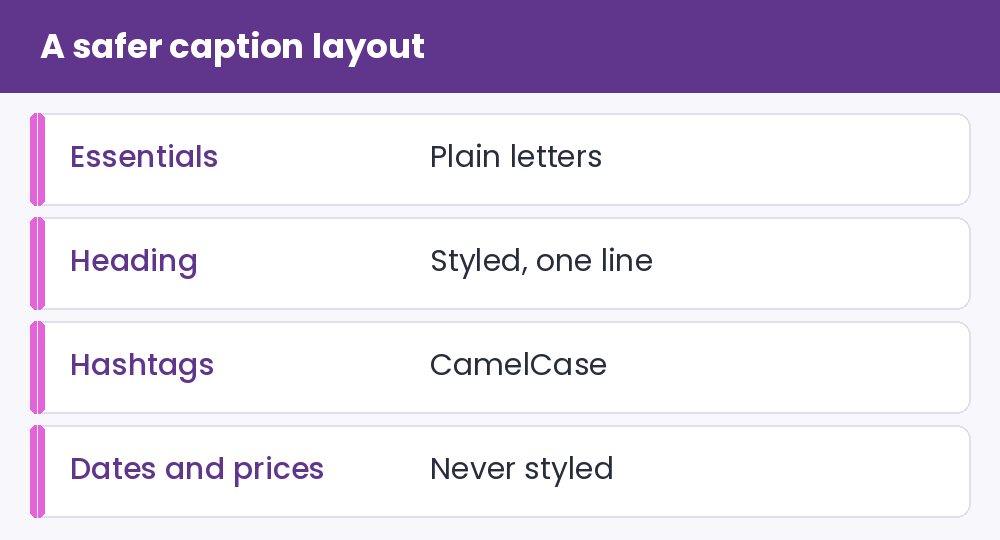
- Style only a few words. One styled name or heading is fine. A whole paragraph is not.
- Keep essential information in plain text. Links, prices, dates, phone numbers, addresses and instructions should never be decorated.
- Write hashtags in camel case. A hashtag like #SummerRecipes is easier for software to read than #summerrecipes, and it is clearer for everyone.
- Limit emoji and symbols. Place them at the end of a line instead of between words. Each one may be read aloud.
- Do not rely on symbols for structure. A row of stars or arrows is read character by character. A blank line is silent and just as readable.
- Add alt text to images. If you post images of stylish text, describe the words in the alt text, because a screenshot cannot be read at all.
How to test it yourself
You do not need special equipment. On an iPhone, you can turn on VoiceOver in Settings under Accessibility. On many Android phones, TalkBack is in the Accessibility settings. Switch it on, open your profile, and listen. If you cannot understand your own bio when it is read aloud, change it. Keep the volume low and learn the shortcut to switch the feature off again before you start, so you do not get stuck.
A fair balance
None of this means you must avoid style. It means you should choose where style is worth the cost. A decorated nickname in your display name is a small, optional flourish. A decorated “Book now” button text is a barrier. Think of fancy text as a garnish and keep the meal in plain letters.
When you experiment in our fancy text generator, try copying the same sentence into a plain note and compare it with the styled version. If the styled one is hard to read for you, imagine how it feels through speech. For a deeper look at how the characters are built, read how fancy text generators work, and for style choices that are easier to read, see our comparison of bold, script, gothic and small caps.
What a real screen reader session sounds like
Switch on VoiceOver on an iPhone or TalkBack on Android and open a post that contains styled text. Plain words are read as words. A styled word may arrive as a long description repeated for every letter, or be skipped entirely. Ten seconds of that is enough to understand why the habit matters. Exact behaviour depends on the reader and its settings, so listen on your own device instead of trusting any description, including this one.
A small personal policy for creators who care
- Put essential information such as dates, prices, links and instructions in plain letters.
- Style one word or one name at most, never a whole paragraph.
- Repeat the idea of a styled heading in the plain caption below it.
- Avoid stacked glitch marks in anything people must read.
- Write hashtags in CamelCase, for example #SummerPlaylist, so readers can split the words.
Plain alternatives still look good. Our case converter turns a headline into Title Case without any unusual characters. The text dividers page offers lines that separate sections visually, though some readers announce symbols aloud, so keep each divider short and use it sparingly.
Answers to common accessibility worries
Do emoji cause the same trouble? They are usually read by their descriptions, which is easier to follow than long lists of letter names, but a long row of them is still tiring to hear.
Is a styled name always a problem? Not always. A short, decorated first name next to a plain surname is a small cost. The risk grows with the amount of text and the importance of what it says.