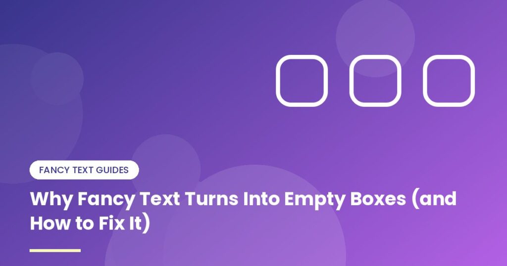
You spent ten minutes on a perfect bio. It looked great on your phone. Then a friend texts: “Your name is just a row of little squares.”
It’s annoying, but it’s also fixable, and it says nothing about you or your phone being broken. Here’s what’s going on.
What those squares are
People call them tofu, because they look like little blocks. A phone shows one when it’s asked to display a character and none of its fonts has a picture for it. The text itself arrived fine. There’s just nothing to draw.
One quick way to tell problems apart: a square or rectangle means a missing font. A black diamond with a question mark inside usually means the text got scrambled on the way, which is a different bug entirely.
Why it happens
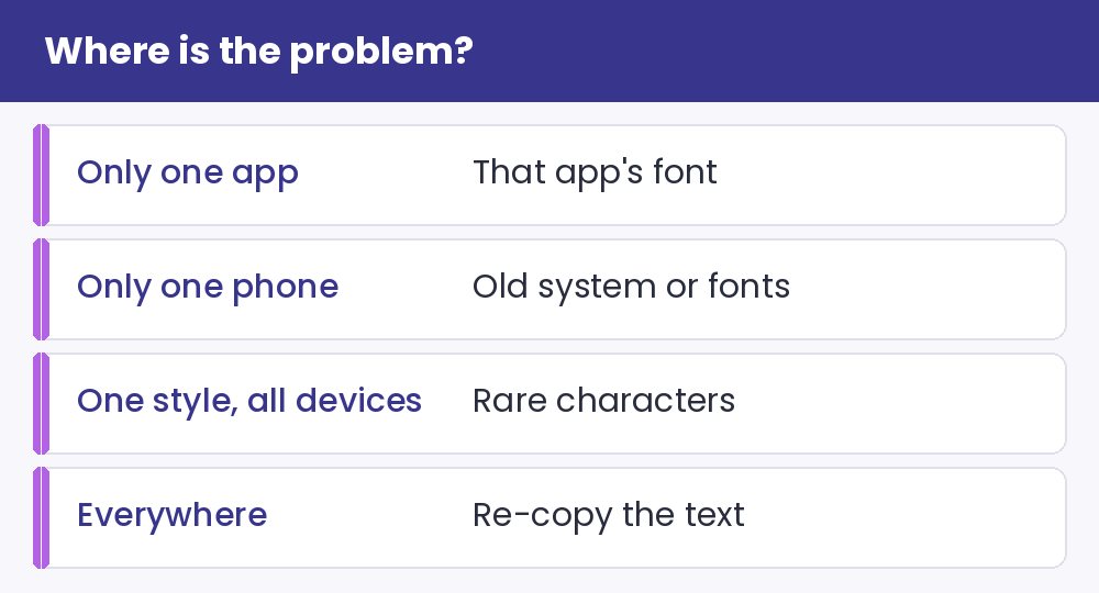
- An old operating system. Many fancy styles live in a part of Unicode that older Android and Windows versions never got fonts for.
- A rare style. Bold and italic are everywhere. Some of the odd ones (squared letters, tiny superscripts, fancy borders) have patchier support.
- The app brings its own font. Some apps and websites ignore the system font and use their own, which may not include the character you picked.
- Newer symbols on older software. Unicode grows every year, so a brand-new symbol might not exist yet on a three-year-old update.
If you’re the one seeing boxes
Start with the boring fixes, because they work more often than you’d think. Update your phone’s software. Update the app. Restart it. Try the same text in a different app or in a browser; if it shows up there, the problem is that one app’s font.
If none of that helps and your phone is simply old, you can’t add the missing characters yourself. Sorry. The workaround is asking the sender for a plainer version.
If you’re the one posting
You can’t control what your followers’ phones look like, so play it safe:
- Stick with the common styles. Bold, italic, script and the usual gothic are reliable almost everywhere.
- Keep anything essential in plain letters, like your name’s searchable part, links and prices.
- Look at your post on a second device, ideally an older one, before you call it done.
- Use fancy text for one short phrase instead of an entire caption. A few missing letters in a long block is a lot more painful than in a single word.
What if boxes show up on your own computer?
That’s rare on Windows, Mac and recent phones. On Linux it’s more common, and installing a broad font set such as Noto usually fixes it. In a browser, it can also be a site that forces its own font, which is something only the site owner can change.
The how-it-works guide explains why this is a font issue and not a bug. If you want an easy way to compare styles, the Instagram fonts page shows them in a preview, and the symbols page has the same caution: popular ones are safest. For readers who use assistive tech, take a look at the accessibility guide too, since it’s the same lesson from a different angle. And you can always go back to the generator and pick a calmer style.